Logo of MyStyleGuide.io, a platform for sharing style guides and branding resources.
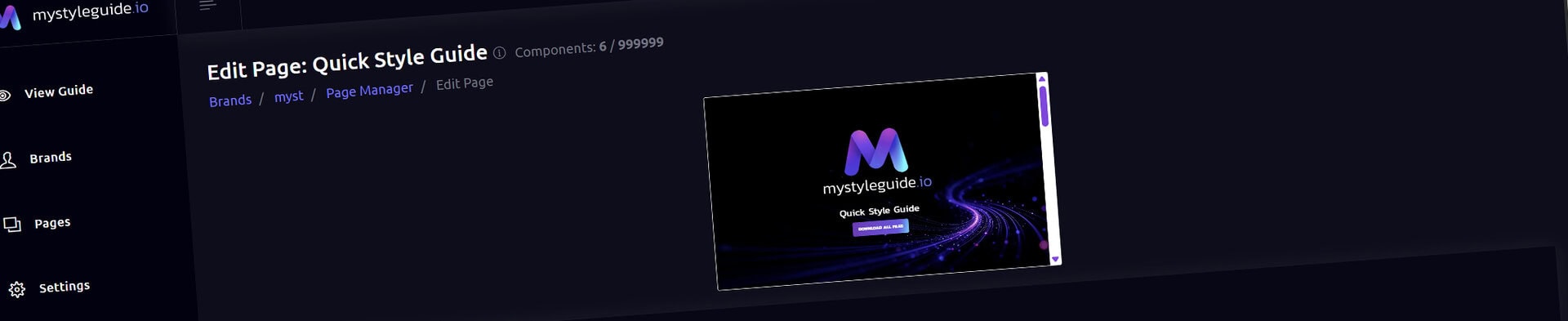
Screenshot of MyStyleGuide.io page editor interface with brand assets.

Page Editor

Build, organize, and customize the content of your brand guide pages.

Page Editor

The Page Editor is where you build the content, layout, and settings for each page in your brand guide. Using a flexible component system, you can create everything from simple text sections to complex, multi-column layouts—all within a visual editing workspace.

If the Page Manager organizes your pages, the Page Editor is where you build and publish them.

What You Can Do

From the Page Editor, you can:

  • Edit the page title, URL, and description
  • Manage the page's publication status
  • Add new components
  • Insert reusable components
  • Rearrange components with drag-and-drop
  • Build multi-column layouts
  • Edit or remove components
  • Preview your page as you work
  • Duplicate the page
  • Save your page

Everything is designed to make building polished, professional brand guides simple and intuitive.


Understanding the Page Editor

When you open a page, you'll find several tools designed to help you build and organize your content.

Page Information

At the top of the editor, you'll see the current page title so you always know which page you're editing.

Live Preview

A built-in preview displays your page as it will appear in the finished brand guide.

As you add, edit, or rearrange components, the preview updates so you can quickly review your changes.

Page Actions

The toolbar includes quick access to:

  • View the page
  • Duplicate the page
  • Open Page Settings
  • Save Page

A Save Page button remains available while you're editing so you can save your work whenever you're ready.


Building Your Page

Every page is made up of individual components.

Components are the building blocks of your guide and can include:

  • Hero sections
  • Images
  • Galleries
  • Color palettes
  • Typography sections
  • Logo displays
  • Icon cards
  • Paragraphs
  • Media sections
  • Layout Rows
  • And many more

Each component appears as a card with options to edit, move, or delete it.


Adding Components

Click Add Component to open the component library.

Choose the type of component you'd like to add, and it will be inserted into your page.

You can continue adding as many components as needed to build your layout.


Using Layout Rows

Layout Rows allow you to create multi-column layouts.

Each row contains separate columns, and each column can hold its own collection of components.

Layout Rows are ideal for:

  • Text beside images
  • Side-by-side content
  • Multi-column galleries
  • More advanced page layouts

Each column works just like a miniature page, allowing you to add, rearrange, edit, and remove components independently.


Reordering Components

Components can be rearranged at any time using drag-and-drop.

Simply drag a component to its new location.

You can also reorder:

  • Components inside Layout Rows
  • Entire Layout Rows
  • Nested content within columns

Once your changes are saved, the preview reflects the updated layout.


Reusable Components

Reusable Components let you share content across multiple pages.

Click Reusable to insert a shared component from your brand library.

You can choose between two options.

Local Copy

Creates an independent copy that can be edited without affecting any other pages.

Global Component

Links directly to the shared component.

Any future edits to the Global Component automatically update every page where it's used.

Global Components are ideal for:

  • Shared hero sections
  • Standard disclaimers
  • Contact information
  • Reusable content blocks

Editing Components

Each component includes an Edit button.

Selecting Edit opens the Component Editor, where you can customize that specific piece of content.

The available options depend on the type of component you're editing.


Page Settings

Select Page Settings to manage the page's information and publication options.

From Page Settings you can edit:

  • Page title
  • URL slug
  • Description
  • Publication status

Updating the URL slug also updates the page's filename and public URL.

Publication Status

Each page can be saved as either a Draft or Published page.

Draft

Draft pages are ideal for work in progress.

They remain visible to users with editing permissions but are hidden from visitors, navigation, shared links, and other public areas of your brand guide. Drafts allow you to build, review, and refine your content before making it available.

Published

Published pages are live and available to anyone with permission to view your brand guide.

Once published, the page becomes part of your guide and appears wherever published pages are available, including navigation and public viewing.

You can change a page's publication status at any time from the Page Settings panel.


Saving Your Changes

Click Save Page to store your changes.

Saving updates:

  • Page settings
  • Component order
  • Layout structure
  • Component assignments

If you've rearranged your layout, you'll be prompted to save before editing additional components. This helps keep the page structure synchronized with your content.

Saving a page stores your changes but does not automatically publish it. Publication is controlled separately through the page's Publication Status.


Live Preview

The preview displays the finished version of your page as you build.

Use it to quickly verify your layout, spacing, images, and content before publishing.


Permissions

Owners and Managers can:

  • Create pages
  • Edit pages
  • Manage page settings
  • Publish and unpublish pages
  • Organize page content

Users with view-only access can browse published pages but cannot edit, publish, or manage page content.


Summary

The Page Editor is where your brand guide comes to life.

From here you can build complete page layouts, organize content with drag-and-drop, create multi-column designs, reuse shared components, manage page settings, control publication status, and preview your work before publishing.

Modern, colorful MyStyleGuide.io logo with a sleek "M" design.

Sharing your brand just got easier

MyStyleGuide.io helps teams prevent off‑brand mistakes by giving everyone a single, reliable place to access your brand assets and guidelines. Built with thoughtful design and real‑world branding experience, it makes communicating your identity simple, consistent, and effortless
© 2023 - 2026 MyStyleGuide.io
  |  
Website Design by: 
Graphic Finesse