Logo of MyStyleGuide.io, a platform for sharing style guides and branding resources.
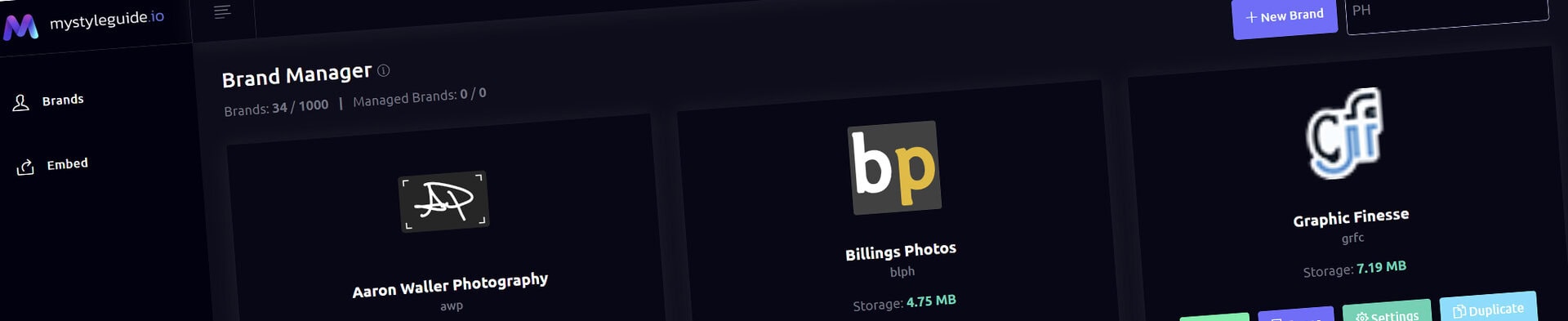
Screenshot of MyStyleGuide.io platform showing brand assets and organization tools.

Image Component

Add clean, flexible images with optional captions and color styling.

Image Component

The Image Component displays a single image with an optional caption, making it ideal for highlighting visuals that deserve individual attention. Whether you're showcasing a logo example, product photo, illustration, or diagram, this component keeps the focus on one image at a time.

Simple, flexible, and theme-aware, it's one of the most commonly used components in a brand guide.


Common Uses

The Image Component is ideal for:

  • Product photography
  • Brand examples
  • Diagrams
  • Illustrations
  • Process graphics
  • Mockups
  • Reference images
  • Standalone visuals

Use the Image Component when a single visual communicates your message more effectively than a gallery.


Image Selection

Choose an image from your brand's media library.

Supported formats include:

  • JPG / JPEG
  • PNG
  • WEBP
  • GIF
  • SVG

Once selected, the image is displayed responsively within your page, adapting to different screen sizes while maintaining its visual quality.


Caption

Optionally include a caption beneath the image.

Captions are useful for:

  • Providing context
  • Explaining diagrams
  • Labeling examples
  • Adding attribution
  • Identifying products or assets

A clear caption helps viewers better understand the purpose of the image.


Color Options

Customize the appearance of the component using optional color settings.

Background Color

Apply a background color behind the image and caption.

This can help separate the image from surrounding content or reinforce your brand's visual style.

Caption Text Color

Choose a custom color for the caption text.

If left blank, the component automatically uses your theme's default typography colors.


Theme Integration

The Image Component works seamlessly with your brand theme.

You can:

  • Choose predefined theme colors
  • Enter custom HEX values
  • Leave fields blank to inherit your default styling

This helps maintain a consistent appearance throughout your brand guide.


Saving Your Changes

Click Save Component to apply your updates.

Your changes are immediately reflected in the live preview, allowing you to review the finished result before continuing.


Tips

  • Use high-resolution images for the best presentation.
  • Add captions whenever additional context improves understanding.
  • Use consistent image dimensions throughout a page for a more polished layout.
  • Use the Gallery Component when presenting multiple related images.
  • Use the Split Content Component when pairing an image with more detailed written content.

Summary

The Image Component provides a simple, elegant way to highlight individual visuals throughout your brand guide.

Whether you're displaying photography, diagrams, illustrations, or examples, it keeps the focus on a single image while integrating seamlessly with your brand's typography, colors, and overall visual style.

Modern, colorful MyStyleGuide.io logo with a sleek "M" design.

Sharing your brand just got easier

MyStyleGuide.io helps teams prevent off‑brand mistakes by giving everyone a single, reliable place to access your brand assets and guidelines. Built with thoughtful design and real‑world branding experience, it makes communicating your identity simple, consistent, and effortless
© 2023 - 2026 MyStyleGuide.io
  |  
Website Design by: 
Graphic Finesse