Logo of MyStyleGuide.io, a platform for sharing style guides and branding resources.
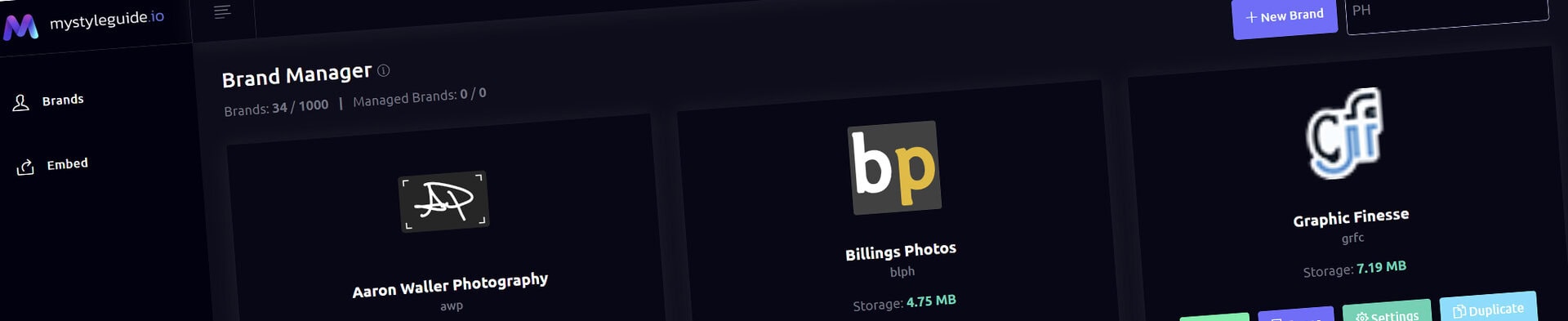
Screenshot of MyStyleGuide.io platform showing brand assets and organization tools.

Layout Row Component

Build flexible multi‑column layouts and nest components inside them.

Layout Row Component

The Layout Row Component is the structural foundation of your page layouts. It allows you to divide a page into columns, then place any combination of components inside those columns to create flexible, responsive designs.

Think of a Layout Row as a container that organizes and displays your content.


Common Uses

The Layout Row Component is ideal for:

  • Two-column content layouts
  • Three-column feature sections
  • Sidebars
  • Comparison layouts
  • Icon grids
  • Mixed media layouts
  • Complex page structures

Whenever you need more than a single vertical column of content, a Layout Row provides the flexibility to build it.


Row Settings

Configure the appearance of the entire row.

Background Color

Apply a background color behind every column in the row.

This creates visual separation between sections while reinforcing your brand's color palette.


Text Color

Define the default text color for components contained within the row.

Individual components can still override this setting when needed.


Full Width

Choose whether the row spans the full width of the browser or remains within the page's content area.

Full-width rows are ideal for:

  • Hero sections
  • Image showcases
  • Visual callouts
  • Large content breaks

Contained rows work well for standard page content.


Building Columns

Each Layout Row can contain one or more columns.

Every column has its own width and optional styling, allowing you to build layouts that range from simple to highly customized.

Common layouts include:

  • 50 / 50
  • 60 / 40
  • 70 / 30
  • 33 / 33 / 33
  • Single-column (100%)

Choose the layout that best supports your content.


Column Styling

Each column can inherit the row's styling or define its own appearance.

Available options include:

  • Background color
  • Text color

This makes it easy to highlight specific content or create alternating sections within the same row.


Nested Components

Columns can contain any supported component.

For example:

  • Paragraphs
  • Images
  • Galleries
  • Heroes
  • Brand Components
  • Additional Layout Rows

Because Layout Rows can contain other Layout Rows, you can build sophisticated page structures while maintaining a consistent editing experience.


Organizing Columns

Columns can be reordered using drag-and-drop.

Rearranging columns makes it easy to experiment with different layouts without rebuilding your content.

Columns can also be added or removed as your page evolves.

Note: Deleting a column also removes any components it contains.


Theme Integration

Layout Rows integrate directly with your brand theme.

You can:

  • Select predefined theme colors
  • Enter custom HEX values
  • Leave fields blank to inherit your default styling

This ensures your layouts remain visually consistent throughout your brand guide.


Saving Your Changes

Click Save Component to apply your updates.

Your changes are immediately reflected in the live preview, making it easy to review your layout before continuing.


Tips

  • Start with simple layouts before building more complex structures.
  • Use column widths to guide attention toward your most important content.
  • Keep related content together within the same row.
  • Use Full Width rows sparingly to create visual emphasis.
  • Nest Layout Rows only when additional structure is truly needed.

Summary

The Layout Row Component provides the structural framework for building responsive page layouts.

By combining flexible columns with nested components, it allows you to create everything from simple two-column sections to sophisticated multi-column designs while maintaining a clean, organized editing experience.

Modern, colorful MyStyleGuide.io logo with a sleek "M" design.

Sharing your brand just got easier

MyStyleGuide.io helps teams prevent off‑brand mistakes by giving everyone a single, reliable place to access your brand assets and guidelines. Built with thoughtful design and real‑world branding experience, it makes communicating your identity simple, consistent, and effortless
© 2023 - 2026 MyStyleGuide.io
  |  
Website Design by: 
Graphic Finesse