Logo of MyStyleGuide.io, a platform for sharing style guides and branding resources.

Hero Component

Create bold, high‑impact hero sections using color, images, or video.

The Hero Component is one of the most visually powerful elements in MyStyleGuide.io. It lets you build a full‑width hero section with customizable backgrounds, overlays, typography, logos, and optional buttons.
It’s perfect for page headers, section intros, or any moment where you want to make a strong first impression.

🌟 What You Can Do with the Hero Component

Inside this component, you can:

  • Choose a background type: color, image, or video
  • Add a logo, headline, and subheadline
  • Customize overlay color and opacity
  • Control text and button styling
  • Adjust height for dramatic or subtle layouts
  • Enable video playback options (loop, mute, autoplay)
  • Maintain brand consistency with theme‑aware color options

It’s flexible enough for everything from minimalist headers to cinematic hero banners.

🧭 Component Overview

When you open the Hero Component in the Component Editor, you’ll see three main sections:

1. Hero Background

This section controls the visual foundation of your hero.

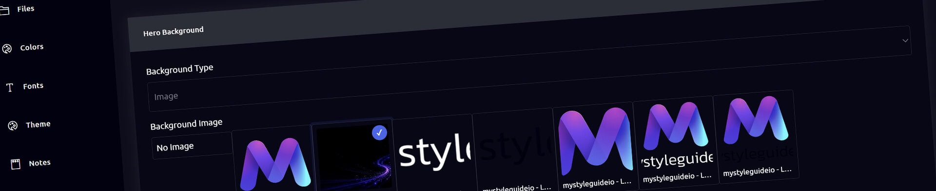
Background Type

Choose one of three options:

Color

A solid background color — clean and minimal.

Image

Select an uploaded image to fill the hero background.

Video

Select an uploaded video for a dynamic, motion‑driven hero.

Switching the background type reveals the relevant settings.

Image Background Settings

If you choose Image, you can:

  • Select an image from your uploads
  • Add an optional overlay color
  • Adjust overlay opacity (0–1)

The overlay helps improve text readability.

Video Background Settings

If you choose Video, you can:

  • Select a video file
  • Enable Loop
  • Enable Mute
  • Enable Autoplay

Most browsers require autoplaying videos to be muted, so these settings work together.

You can also apply an overlay color and opacity to videos.

Background Color

If your background type is Color, choose a solid color from:

  • HEX values
  • Theme color presets
  • Or leave blank for default styling

2. Typography & Button Style

This section controls the text and optional button inside the hero.

Headline Color

Sets the color of the main hero headline.

Text Color

Controls the subheadline and general text.

Button Style

Choose from:

  • Accent (Primary)
  • Light
  • Dark

This determines the visual style of the optional download button.

3. Content

This section controls the actual content displayed inside the hero.

Hero Logo

Select an image to display above the headline — often a brand mark or icon.

Headline

The main title of the hero section.

Subheadline

A supporting line of text, perfect for short descriptions or taglines.

Show Download Button

Enable this to display a button that lets users download brand assets or files.

Height

Set the height of the hero section.

Examples:

  • 60vh (default)
  • 100vh (full screen)
  • 500px (fixed height)

This gives you full control over the hero’s visual impact.

🎨 Theme‑Aware Color Options

All color pickers automatically pull from your brand’s theme colors, including:

  • Light / dark backgrounds
  • Highlight colors
  • Typography colors

This ensures your hero sections stay visually consistent with your brand.

💾 Saving Your Changes

As you edit:

  • Fields update the component’s JSON automatically
  • The preview refreshes in real time
  • Click Save Component to finalize your changes

Your hero will now appear on the page exactly as configured.

🎯 Summary

The Hero Component helps you:

  • Build bold, immersive hero sections
  • Use color, image, or video backgrounds
  • Add overlays for readability
  • Customize typography and button styles
  • Add logos, headlines, and subheadlines
  • Maintain brand consistency with theme‑aware options

It’s one of the most expressive and impactful components in MyStyleGuide.io.

More Tutorials

See All Tutorials
Modern, colorful MyStyleGuide.io logo with a sleek "M" design.

Sharing your brand just got easier

MyStyleGuide.io helps teams prevent off‑brand mistakes by giving everyone a single, reliable place to access your brand assets and guidelines. Built with thoughtful design and real‑world branding experience, it makes communicating your identity simple, consistent, and effortless
© 2023 - 2026 MyStyleGuide.io
  |  
Website Design by: 
Graphic Finesse